A random bit of trivia I find interesting is that the novelist Kurt Vonnegut tried to get a MA in anthropology, but his thesis was rejected for being too simple. His idea was that stories from different societies could be graphed. Looking up some examples made by modern artists the visualizations don’t really show anything useful but they are fun. The use of computers has allowed for new visualization processes to be created and there are many uses for historians.
Data visualization is not new. Frederick W. Gibbs said it best in New Forms of History: Critiquing Data and Its Representations
Maps, charts, and graphs, among many other forms, have always been used to explain, clarify, and enhance long-form prose. On the other hand, two particularly noteworthy differences should encourage us to consider data, visualizations, and interfaces in new ways.
Gibbs
Maps, in particular, are a long-honored form of data visualization, and I for one personally love maps, especially old ones. Sanborn fire insurance maps like the one below for example are one of my favorite tools for looking at the history of towns.
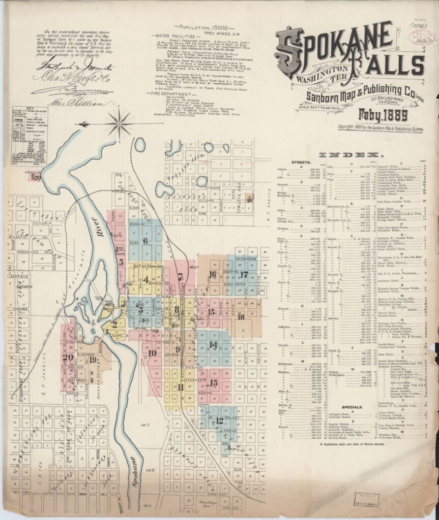
. Sanborn Map Company, Feb, 1889. Map. https://www.loc.gov/item/sanborn09331_003/.
In an article written for the Smithsonian Magazine titled The Surprising History of the Infographic Clive Thompson uses the example of Civil War-era maps that showed the slave populations throughout the Southern States to illustrate the use of maps as a tool for data visualization. These maps are available to look at on the Stanford Library Exhibits page for Slavery to Segregation, as well as in the Library of Congress. If they were colored more vividly many of these maps would be similar to any infographic map you would see spread on the internet today. I am especially fond of the map that shows the distribution of the slave population using the 1860 census data. I like this map because it uses the counties throughout the south, and looking at my home state of Kentucky something caught my eye. My home county, Henderson, is one of the darker counties in the state.
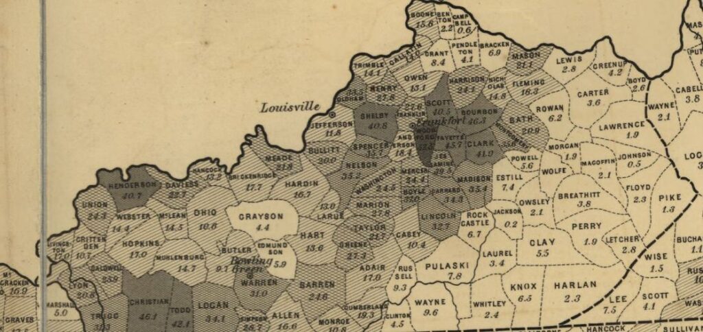
. Washington Henry S. Graham, 1861. Map. https://www.loc.gov/item/99447026/.
I knew the neighboring Union County was pro confederacy and that there was a slave population in the region, but to see how the two compared to the rest of the state was interesting. Then seeing how Kentucky, which remained neutral at the start of the war before siding with the Union, compared to a state that seceded like Virginia, it makes Lincolns’ interest in the map understandable.
Maps are only getting better as well with the modern application of GIS software. Creating various spatial analysis tools that have a wide range of uses for the humanities such as the use of ArcGIS to make temporal representations of things like the shipments of goods as discussed in The Fir Trade in Canada Mapping Commodity Flows on Railways. Although GIS is a powerful tool, it can be difficult to learn, and it does still have its limitations when it comes to being used by historians. From The Fir Trade in Canada Mapping Commodity Flows on Railways
Like many aspects of GIS, its temporal capabilities often exceed what historians need. Any of those data types above can use calendar or non-calendar time scales up to fractions of a second apart. Historians often have much coarser temporal details for our data (months or years), or we want to map features in decades or even centuries. Moreover, we are often missing or uncertain of key dates. GIS lacks the ability to incorporate most of these uncertainties, and cartographers often have to get creative when mapping historical features.
MacFadyen
The other issue with the use of GIS is the need to have data available, if there isn’t already some form to access and plug into the software than the users will have to create datasets for themselves, and the GIS software will run into problems if there are inconsistencies or gaps in the data that the Historians themselves intentionally left out because it was unneeded for their goal.
Another notably old infographic is the 1931 Histomap which maps the ebb and flow of different civilizations. The Histomap goes great with this fun youtube video about this history of the world, although I’m sure there are some gaps in its mapping of Pre-Columbus American cultures. In my experience longer infographics like this also tend to be less interesting for general use especially when they lack interactivity. It’s why I had trouble using even fun ones in my classes. Even interactive infographics can lose the viewers attention fast if it just takes too long to understand, I don’t think anyone I know has scrolled all the way through the “If the Moon Were a Pixel” for example.
The ability to utilize different forms of visualization to reinforce an analysis is underappreciated in many of the readings. However, looking at the Voltaire letters from the Mapping of the Republic of Letters there is an interesting series of graphics with one depicting where Voltaire’s letters were sent on a map, and another being a series of pie charts breaking down the number of Voltaire’s correspondents by nationality. These two different forms of data visualization work together to form a picture of where Voltair was sending his letters to in a more interesting way than simple numbers do.
Overall when going through the readings for class this week discussing data visualization I really was just reminded that I like looking at charts and graphs when I can understand them. It was also clear that, as highlighted by Gibbs, there wasn’t a lot of critiques of the data being shown on these websites. I’m almost certain I could post an infographic online somewhere and as long as it had a little sources cited box in the corner no-one would question the accuracy of the data represented, or if it was just historically accurate. It isn’t difficult to make a map show whatever data you want it to or to manipulate the way the data is represented to better present an arguament, as seen when politicians use election maps. Really just google search election map by county and then election map with that data also being porportional to the population in each county and there are different messages using the same data. Data visualization is a tool, and its use warrants critical judgement same as any other.
October 13, 2020 at 2:24 pm
Good work. I like that you covered Sanborn maps. I focused a bit on mortality and crime rates, but Sanborn maps are a great example of visualization tools. I agree with your conclusion as well. I think that being able to critique and understand graphics and charts is crucial if we are to succeed in making valid historical analyses. As we’ve seen throughout history, you can manipulate statistics to say almost anything.
October 13, 2020 at 9:28 pm
I agree with both you and Jeremy, however it leads to a question on your conclusion (one that I’m still chewing on, myself): Is data visualization a tool primarily for communicating data to others or making connections with the data ourselves? Of course the distinction between the two will mater when critically examining it, but is one more in need of critique than the other?
October 14, 2020 at 10:57 am
Can’t data visualization both be a tool for communication and discovery? Or perhaps you meant which is data visualization used more for rather than is it used for one thing rather than the other. If so, I’d probably say data visualization is usually used more for communication because not as many people are doing original research which would require using data visualizations as sources of discovery. Many people are using data visualizations to communicate points they feel need to be heard though as a result of social media and other such products of the Information Age, i.e. they would rather easily look at pictures than labor through a wall of text. However, I don’t think this means one is more in need of critique than another. I think both are in need of serious critique for their own reasons as a result of the changing times we find ourselves in.